
| 일 | 월 | 화 | 수 | 목 | 금 | 토 |
|---|---|---|---|---|---|---|
| 1 | 2 | 3 | 4 | |||
| 5 | 6 | 7 | 8 | 9 | 10 | 11 |
| 12 | 13 | 14 | 15 | 16 | 17 | 18 |
| 19 | 20 | 21 | 22 | 23 | 24 | 25 |
| 26 | 27 | 28 | 29 | 30 | 31 |
Tags
- matplotlib
- visualizing
- pandas
- 자바스크립트
- Agile
- tensorflow
- algorithm
- 애자일
- angular
- TypeScript
- javascript
- 판다스
- 크롤링
- python
- 프로젝트
- 다나와
- Project
- Crawling
- opencv
- DANAWA
- webcrawling
- data
- adaptive life cycle
- data analyze
- Scrum
- AWS
- ECS
- Method
- keras
- analyzing
Archives
- Today
- Total
LiJell's 성장기
Pandas Styling: 판다스 스타일링 본문
반응형
import pandas as pd
import numpy as np

np.random.seed(88)
df = pd.DataFrame({'A': np.linspace(1,10,10)})
df = pd.concat([df, pd.DataFrame(np.random.randn(10,4), columns = list('BCDE'))],
              axis= 1)
df.iloc[3,3] = np.nan
df.iloc[0,2] = np.nan
Styling the DataFrame
1. Highlight: 하이라이트
Highlight Min-Max values
- For highlighting maximum values : chain '.highlight_max()' function to the styler object
- Additionally, you can also specify the axis for which you want to highlight the values
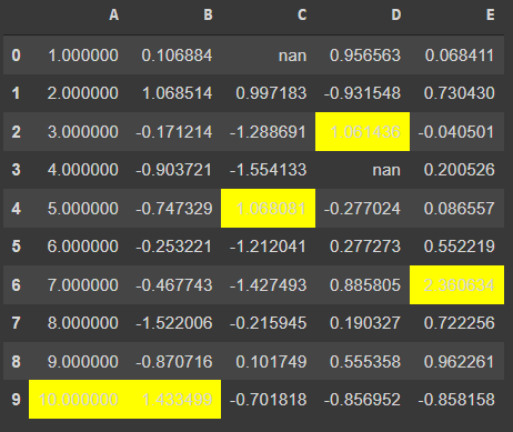
1.1.Highlight Max values
- Without Styling
print(df)- With Styling
df.style.highlight_max()- default는 axis =0
- axis= 0 은 raw들의 같은 위치값을 가지는 수 끼리 비교하여 max 값을 highlight.
- 행렬의 개념으로 생각하면 됨
df.style.highlight_max(axis=1)- axis =1 은 columns 의 같은 위치 값을 가지는 수 끼리 비교하여 가장 큰 값을 highlight

1.2. Highlight Min values
df.style.highlight_min()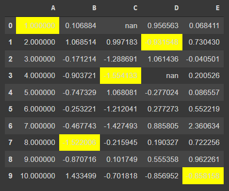
df.style.highlight_min(axis=1)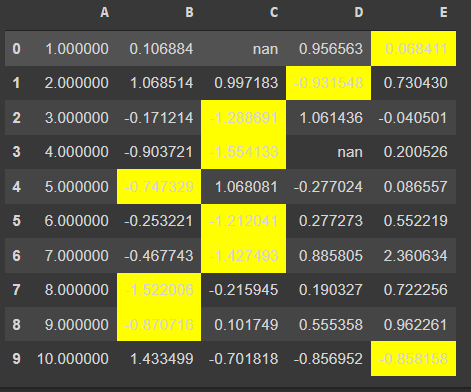
1.3. Highlight Null values
- set_na_rep() : along with highlighting the missing values, they may be represented as 'nan'. You can change the representation of these missing values using the set_na_rep() function
- This function can also be chained with any styler function but chaining it with highlight_null will provide more details
df.style.highlight_null()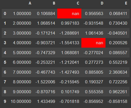
df.style.highlight_null(null_color='green')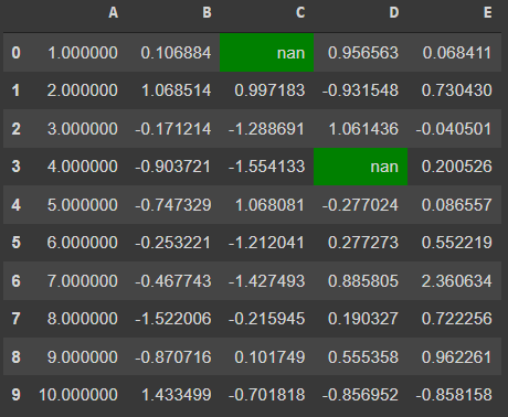
df.style.set_na_rep("OutofScope").highlight_null(null_color="orange")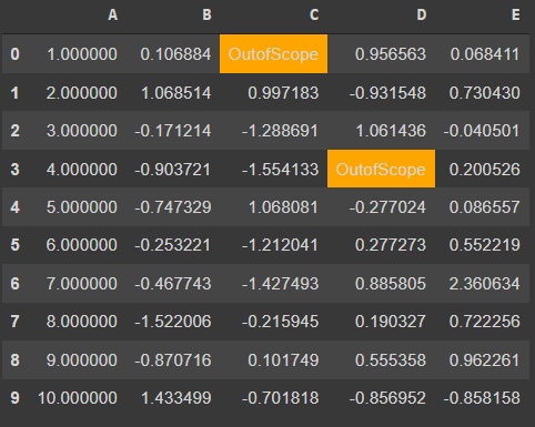
2. Create Heatmap within dataframe: 히트맵
- Heatmaps are used to represent values with the color shades
- The higher is the color shade, the larger is the value present.
- These color shades represent the intensity of values as compared to other values.
- To plot such a mapping in the dataframe itself, there is no direct function but the 'styler.background_gradient()' workaround does the work
df.style.background_gradient()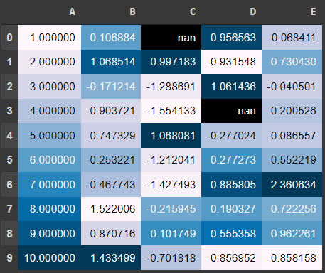
- There are few parameters you can pass to this function to further customize the output generated
-
- cmap : by default, the 'PuBu' colormap is selected by pandas. You can create a custom matplotlib colormap and pass it to the cmap parameter.
-
- axis : generating heat via rows or columns criteria, by default: columns
-
- text_color_threshold : controls text visibility across varying background colors
-
3. Table Properties: 테이블 속성
- The dataframe presented in the Jupyter notebooks( google colab) is a table rendered using HTML and CSS
- The table properties can be controlled using the 'set_properties' method
- This method is used to set one or more data-independent properties → modifications are done purely based on visual appearance and no significance as such.
- This method takes in the properties to be set as a dictionary
df.style.set_properties(**{'border': '1.3px solid green',
                          'color': 'magenta'})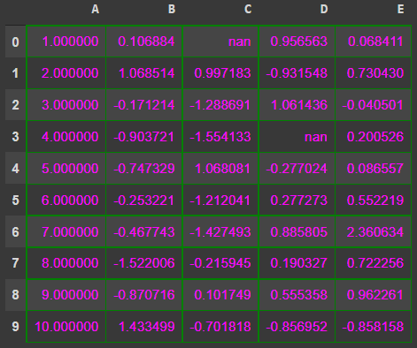
4. Create Bar Charts: 차트 바
- Just as the heat map, the bar charts can also be plotted within the dataframe itself
- The bars as plotted in each cell depending upon the axis selected
- By default, the axis=0 and the plot color are also fixed by pandas but it is configurable.
- To plot these bars, you simply need to chain the '.bar()' function to the styler object
df.style.bar()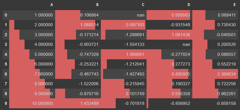
df.style.bar(colors='green')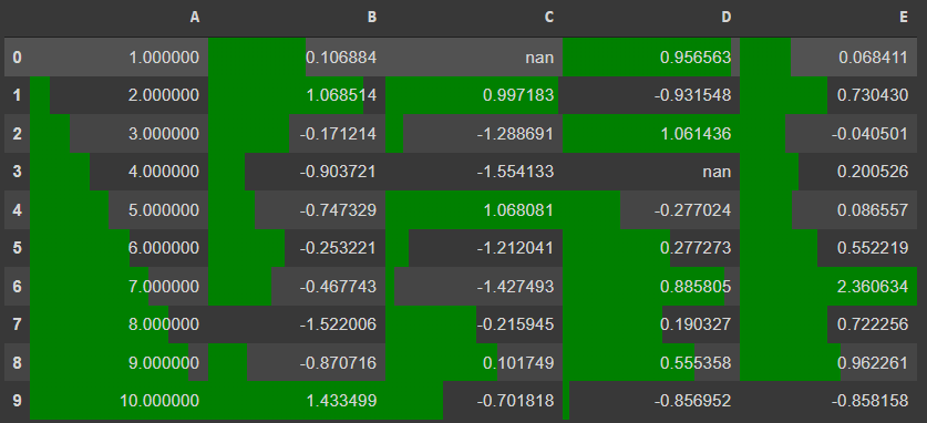
5. Control Precision: 소수점 자리 설정
- Current values of the dataframe have float values and their decimals have no boundary condition
- Even the column 'A', which had to hold a single value is having too many decimal places
- To control this behavior, you can use the '.set_precision()' function and pass the values for maximum decimals to be allowed
df.style.set_precision(2)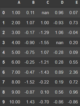
6. Add Captions: 캡션 넣기
- Like every image has a caption that defines the post text, you can add captions to your data frames
- This text will depict what the dataframe results talks about
- They may be sort of summary statistics like pivot tables
df.style.set_caption("This is Dataframe styling demo").set_precision(2).background_gradient()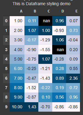
7. Hiding Index or Column: 행렬 숨기기
- You can hide the index or any particular column from the dataframe
- Hiding index from the dataframe can be useful in cases when index doesn't convey anything significant about the data
- The column hiding depends on whether it is useful or not
df.style.hide_index()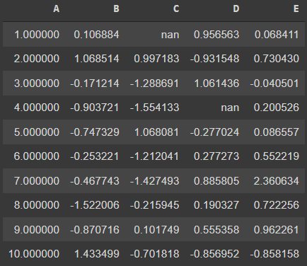
df.style.hide_columns('B')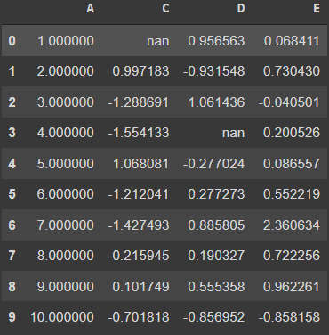
8. Control display values: 값 설정
- Using the styler object's '.format()' function, you can distinguish between the actual values held by the dataframe and the values you present
- The 'format' function takes in the format spec string that defines how individual values are presented
- You can directly specify the specification which will apply to the whole dataset or you can pass the specific column on which you want to control the display values
df.style.format("{:.3%}")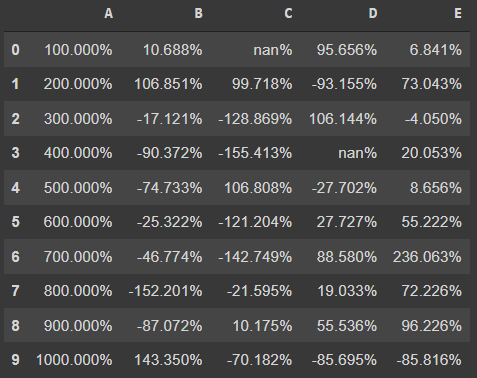
- the missing values have also been marked by the format function → This can be skipped and substituted with a different value using the 'na_rep' (na replacement) parameter
df.style.format("{:.3%}", na_rep="&&")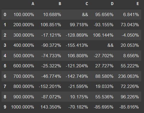
9. Table Styles: 테이블 스타일
- These are styles that apply to the table as a whole, but you don't look at the data
- It is very similar to the set_properties function but here, in the table styles, you can customize all web elements more easily
- The function of concern here is the 'set_table_styles' that takes in the list of dictionaries for defining the elements
- The dictionary needs to have the selector (HTML tag or CSS class) and its corresponding props (attributes or properties of the element)
- The props need to be a list of tuples of properties for that selector
styles = [
    dict(selector="tr:hover",
        props=[("background", "#f4f4f4")]),
    dict(selector="th", props=[("color", "#fff"),
                              ("border", "1px solid #eee"),
                              ("padding", "12px 35px"),
                              ("border-collapse", "collapse"),
                              ("background", "#00cccc"),
                              ("text-tramsform", "uppercase"),
                              ("font-size", 18px)
                              ]),
    dict(selector="td", props=[("color", "#999"),
                              ("border", "1px solid #eee"),
                              ("padding", "12px 35px"),
                              ("border-collapse", "collapse"),
                              ("font-size", 15px)
                              ]),
    dict(selector="table", props=[("font-family", 'Arial'),
                                 ("margin", "25px auto"),
                                 ("border-collapse", "collapse"),
                                 ("border", "1px solid #eee"),
                                 ("border-bottom", "2px solid #00cccc"),
                                 ]),
    dict(selector="caption", props=[("caption-side", "bottom")])
]
df.style.set_table_styles(styles).set_caption("Image by Author (Made in Pandas)").highlight_max().highlight_null(null_color='red')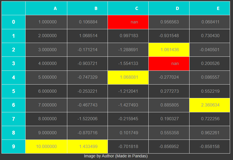
10. Export to Excel: 엑셀에 저장
- You can store all the styling you have done on your dataframe in an excel file
- The '.to_excel' function on the styler object makes it possible
- This function needs two parameters : the name of the file to be saved (with extension 'xlsx') and the 'engine' parameter should be 'openpyxl'
df.style.set_precision(2).background_gradient().hide_index().to_excel('styled.xlsx', engine='openpyxl')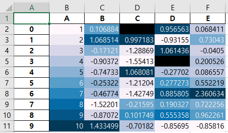
반응형
'Bigdata > 파이썬_Python' 카테고리의 다른 글
| Python Extras (0) | 2022.02.14 |
|---|---|
| 19.python_pandas_practice (0) | 2022.01.10 |
| 18.python_visualization (0) | 2022.01.10 |
| 17.python_datetime_expression (0) | 2022.01.10 |
| 16.python_NA_missing_duplicate_value (0) | 2022.01.10 |
Comments